Wednesday, April 25, 2012
Bristol Silhouette
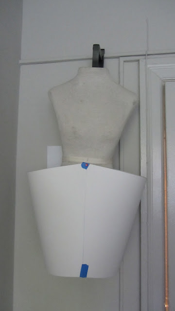
Problem solving has been challenging because paper is not fabric and it has its own personality, so to force it to move and fold like fabric is impossible. I have tried to master different ways of constructing the garment and have decided to create a base with protruding side hips and slimed down skirt as it goes to the floor.
Letting the bristol paper speak to me and guide me instead of pushing it into a mold that it does not want to work in, it will benefit the piece much better and help me keep the look cleanly constructed, instead of crumpled and tearing because there is so much tension.
To combine the pieces I will use a white string, that way it will blend in and would look seamless.
Art to Wear: Fashion Piece
I got really inspired by this idea of accentuating the hips and making it into a paper dress that could be sculptural but cleanly designed to convey the message of women's hips and its issues in a more positive outlook.
Lately the area around the hips has been prominent in the fashion design, where before women always tended to hide their curves and feel ashamed of them. I feel these images are very inspiring not only from a design point of view but also from a female perspective, which encourages females to love their bodies.
Thursday, March 15, 2012
Animal/Creature Sculpture
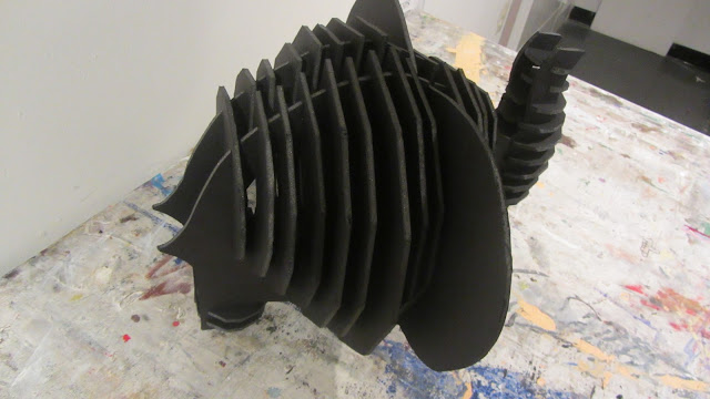
The animal form had to be experienced with materials first. The foam core material itself guided my process of what I could do and what had to be resolved and changed to accomplish the initial idea I had for the elephant sculpture. The moquette had been a terrific way of experimenting with the material and processing my ideas in a three dimensional nature. It showed me the possibilities of multiple shaped polygons that could be transformed into a representational form with gradating scale of the object defining its volume. By creating a void inside of the elephant, one can view the object’s skeleton structure, the outside and the concavity of the inside working composition. The hollow space opened up the piece and created a stronger visual interest as well as making it seem lighter but with a solid, interacted and slotted compositional pieces. It resulted in some problems solving techniques but overall the repetitive nature of the piece infused the object with rhythm and visual push and pull dynamic of constructed material and airy design.
Architectonic Sculpture
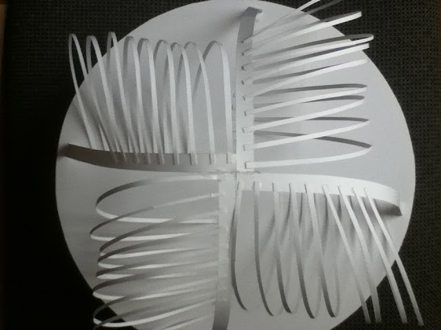
This structure was influenced by modern architecture and biomorphic qualities. Its serial planes are stacked up one on top of each other to create a visual upside down cone. It plays with the idea of balance while challenging gravitation pull. With its largest plane being on the very top of the sculpture it created gradation and pattern. The thin lines on the very top of the form are very organic and loose, which are reminiscent of human rib cages or ribbed vaulting in Gothic architecture. I wanted to play with the scale and create a more dynamic composition by increasing the scale of the planes as they were getting taller in space. This way it allowed me to design bigger “rib cages” on top of the serial plane to make the piece visually strong and unified with the masculine and delicate qualities. Because, of the open design, one can look through the architectonic sculpture from several different angles and see that it also interacts with light and shadow by creating linear lines from the reflection of the positive and negative spaces.
Modular Relief
The Rio Antirio bridge has been my inspiration for the relief and it has been transforming and evolving over time I have been working on it. This piece in particular has been very challenging in a sense that it had gone through several holding mechanisms to be able to stay attached together. However, with several tries and by turning the composition around it resulted into a solid and rhythmic form that creates shadows with the negative and positive spaces. I wanted it to be a simple but structured design that would play with light and shadow and have a tactile quality. The repetitive pattern is the main focus of the piece, which displays order but also unique negative and positive spaces that farther allows the light to interact with the delicate triangular lines.
Wednesday, February 22, 2012
Modular Creature
For this project we had to use polygon shapes in multiples to create an animal out of white foam core. I have chosen to do an elephant based on a couple of salt shakers that I use purely for decoration.
The elephant is a moquette and will probably go through a lot more changes before it gets to a final and completed state.
Subscribe to:
Comments (Atom)


